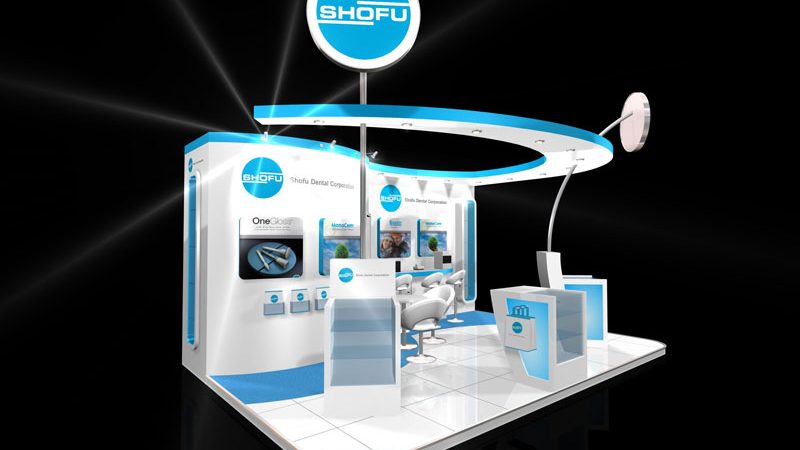
Exhibition stand design and build
-
Call Us On
0049 69 257378649
-
Mail Us @
Steps to make your exhibition successful

Steps to make your exhibition successful
There is a lot of discussion about advertising services and products at shows, and that reveals both an obstacle and an occasion to businesses. In marketing, moving with the stream is deemed as a good option. However, there is a frustrating battle for attention these days. What you can do is enhance and accentuate your profile campaigns through event promotion.
Stand designs can be categorized into five varieties namely: peninsula, head, corner, walk through and row. A peninsula stand is open up in all parts while a headstand features a backdrop in one side but is open in three sides. Corner and walk-through stands have two open sides and two wall sides. In a corner stand, two walls are adjoined together, forming a corner. In a walk-through stand, the two walls are set up across each other, providing a pathway. An in-line stand has only one open side.
When choosing from the previously mentioned designs, it’s important to think about the position of and space around your booth. For booths with large surroundings, a peninsula stand is the greatest option. A row stand provides privateness and exclusivity, which can be convenient if there are booths alongside and behind yours. A corner stand performs well if your booth is on a corner or alongside a structure. You may also make use of a double-decker stand if your organizers and also the venue allows. With this, you can mix and match different stand layouts.
In order to determine the role exhibitions play when compared to other marketing resources, a company must take two key elements into account: the concentration of conversation and personal interactions. In a marketing and communications conditions concentration levels are particularly low. On the other hand, they maximize with the use of media within the dialogue, e.g. with electronic media, culminating in a personal meeting and a conversation, for instance on the stand. Strenuous focusing on of the senses starts with the sending of abstract information and boosts with the use of a multimedia experience, e.g. audiovisual dissemination of information and facts, concluding in a go through, in which information is recognized by all the senses.
One of the more effective ways to outshine your competitors is to keep your high visible exhibition stand design is well-lit. You do not want your exhibition stand to be treated being a shadow or backdrop of other stands, do you? Apart from lighting systems, another way of getting interested in your stand is featuring screens.
Is your brand name identifiable in several instances? This can be a question you need to ask your stand company. Regardless of whether you implement blocks of letters, hanging banners, or displays, be certain everything is impressive. This way, your brand name, and tagline can be seen by event-goers even from afar.
Make specially
Global brands and international making businesses have their stands tailor-made to match their unique characteristics and colors. Do some resemble their products? shapes. If you can not have the funds for such advanced customizations, you can concentrate on having more simple structures using wallpaper graphics and hiring displays instead. These elements should prominently present your brand name, logo, slogans and other advertising messages. Having bespoke furniture that enhances your brand colors can even help.
Your choice of a stand is determined by several aspects that only you have an answer to. Your choice of an exhibition stand design will have an effect on your functionality at an exhibition and will be a beneficial expenditure to those who take exhibiting seriously. By selecting a quality exhibition stand you will be able to concentrate on other objectives. Exhibitions design need to be well prepared and exhibition stands aspects and must be treated as such, so make your decisions carefully.
Last Updated on April 14, 2023 by Traxor-designs
